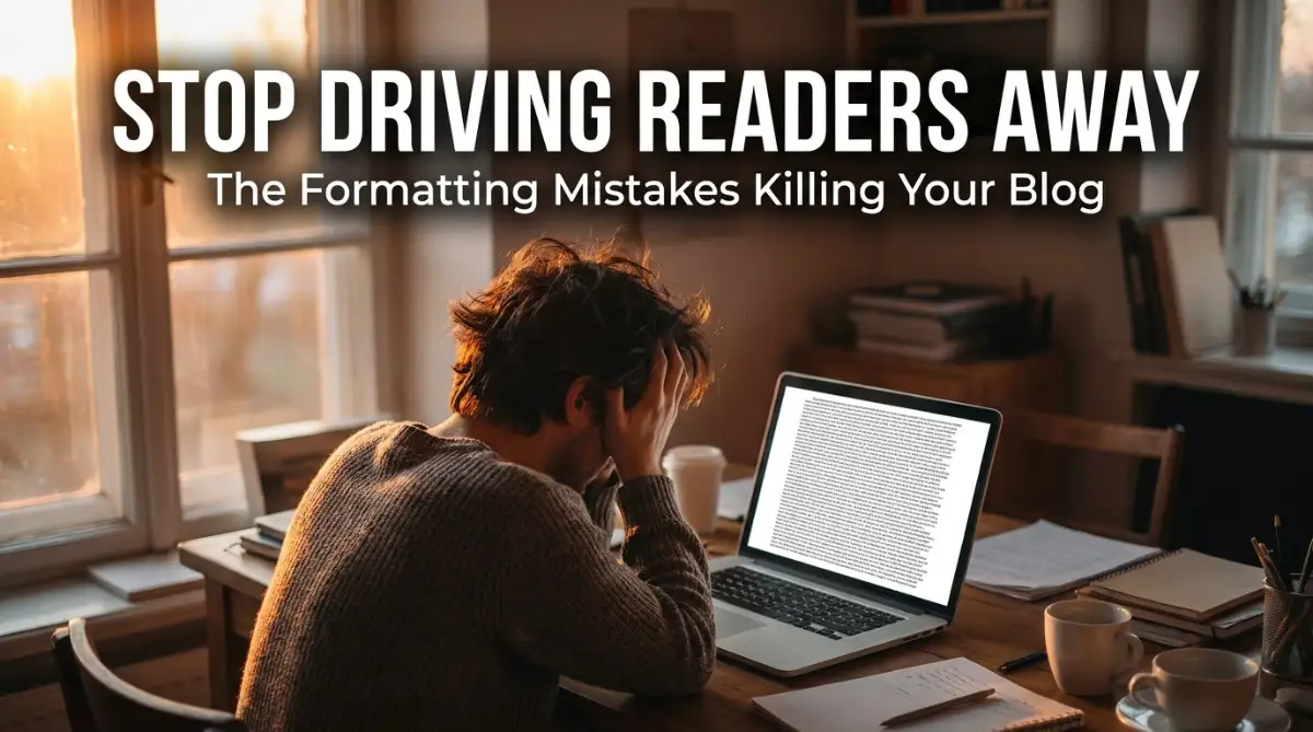
The Heartbreak of Hitting Publish to Empty Rooms
I still remember the exact moment I realized my writing was completely failing to connect. I had spent three entire days researching and writing what I thought was an absolute masterpiece of an article. I poured my heart into the keyboard, feeling incredibly proud of the depth and detail I managed to include.
I hit the publish button, expecting a flood of positive comments and eager readers. Instead, the Google Analytics dashboard told a completely different, heartbreaking story. People were clicking on the link, but the average time spent on the page was less than ten seconds.
They were abandoning my site almost immediately. It felt like inviting guests to a grand dinner party you spent days preparing, only for them to take one look at the dining room and walk right out the front door. I felt completely defeated, wondering if my writing simply was not good enough for the internet.
This is the exact pain thousands of new and experienced bloggers face every single day. You put massive effort into sharing your knowledge, hoping to help someone or build an audience. But when readers bounce away instantly, it destroys your motivation to keep going.
The mental toll of this constant rejection is heavy. You start second-guessing your ideas, feeling like you are simply wasting your time talking to an empty room. You spend hours researching SEO, trying to force more traffic to your site, completely ignoring the massive leak in the bucket.
The reality is that your writing is probably excellent. The ideas are solid, and the research is sound. The real problem is almost always how the text visually appears on the screen.
How the Human Brain Processes Online Reading
To fix this frustrating issue, we have to understand exactly what happens when a person clicks on your article. People do not read online content the same way they read a printed novel. We are wired differently when staring at a glowing screen.
When a reader lands on your page, they are usually looking for a quick solution to a specific problem. They are in a hurry. Their brain instantly scans the page to determine if the effort of reading is worth the potential reward.
If the brain perceives the text as too difficult, too dense, or too demanding, it triggers an immediate flight response. This happens in the blink of an eye. Before they even read your first brilliant sentence, they have already judged the visual weight of your content.
This is deeply tied to something called cognitive load. Cognitive load is the amount of mental effort required to process information. When you present someone with a massive, unbroken block of text, their cognitive load skyrockets immediately.
Think about walking into a highly cluttered, messy room looking for your keys. You feel instantly overwhelmed because there is no clear path for your eyes to follow. A badly formatted blog post gives your reader that exact same feeling of anxiety and confusion.
We have to lower that cognitive load aggressively. We do this by turning reading from a difficult chore into a smooth, effortless slide down the page.
The Deadly "Wall of Text" Trap
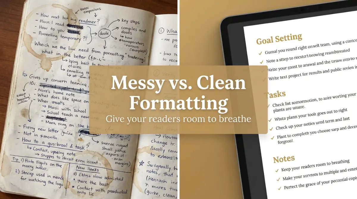
The single most common mistake I see on newly published blogs is the dreaded wall of text. This happens when a writer groups ten or twelve sentences together into one massive paragraph. It looks like a solid brick of words sitting on the screen.
In school, we were taught that a paragraph needs an opening, several supporting sentences, and a conclusion. That rule works beautifully for academic papers. However, that rule will absolutely destroy your reader retention on the internet.
When a person sees a giant block of text, they easily lose their place while reading. Their eyes have to work incredibly hard to track back from the end of one line to the beginning of the next. This physical eye strain makes people tired very quickly.
To fix this, you must rethink what a paragraph actually is. In the world of online writing, a paragraph is a visual breathing space, not just a grammatical unit. You should limit your paragraphs to a maximum of two or three sentences.
Sometimes, a single sentence is powerful enough to stand entirely on its own. Breaking up your thoughts creates a massive amount of white space on the page. White space is the blank area around your text, and it is the most powerful tool in your formatting arsenal.
White space gives the reader's eyes a place to rest. It makes the content feel light, breezy, and manageable. By simply hitting the "Enter" key more often, you instantly make your article look fifty percent easier to read.
Typography Mistakes You Might Be Ignoring
Even if you break your text into small pieces, the actual shape and style of the letters matter immensely. Typography is the art of making written language legible, readable, and visually appealing. Many beginners completely ignore the default font settings on their website.
The first major error is using a font size that is way too small. If your reader has to squint or bring their phone closer to their face, they will just leave. Your main body text should ideally be at least 16 pixels, and sometimes up to 18 pixels depending on the font family.
Another massive typography trap is poor line height. Line height is the vertical space between the lines of text within a paragraph. If the lines are squished too closely together, the words blend into a confusing mess.
If the lines are too far apart, the text feels disconnected and hard to follow. A good general rule is to set your line height to 1.5 or 1.6 times the size of your font. This creates a comfortable, airy reading experience that guides the eye naturally downward.
I used to think making my font smaller and tighter made my blog look more serious and professional. I quickly realized I was just giving my readers terrible headaches and chasing them away to my competitors. Setting my font to 18px with a 1.6 line height changed my bounce rate overnight.
The Mobile Reading Experience Breakdown
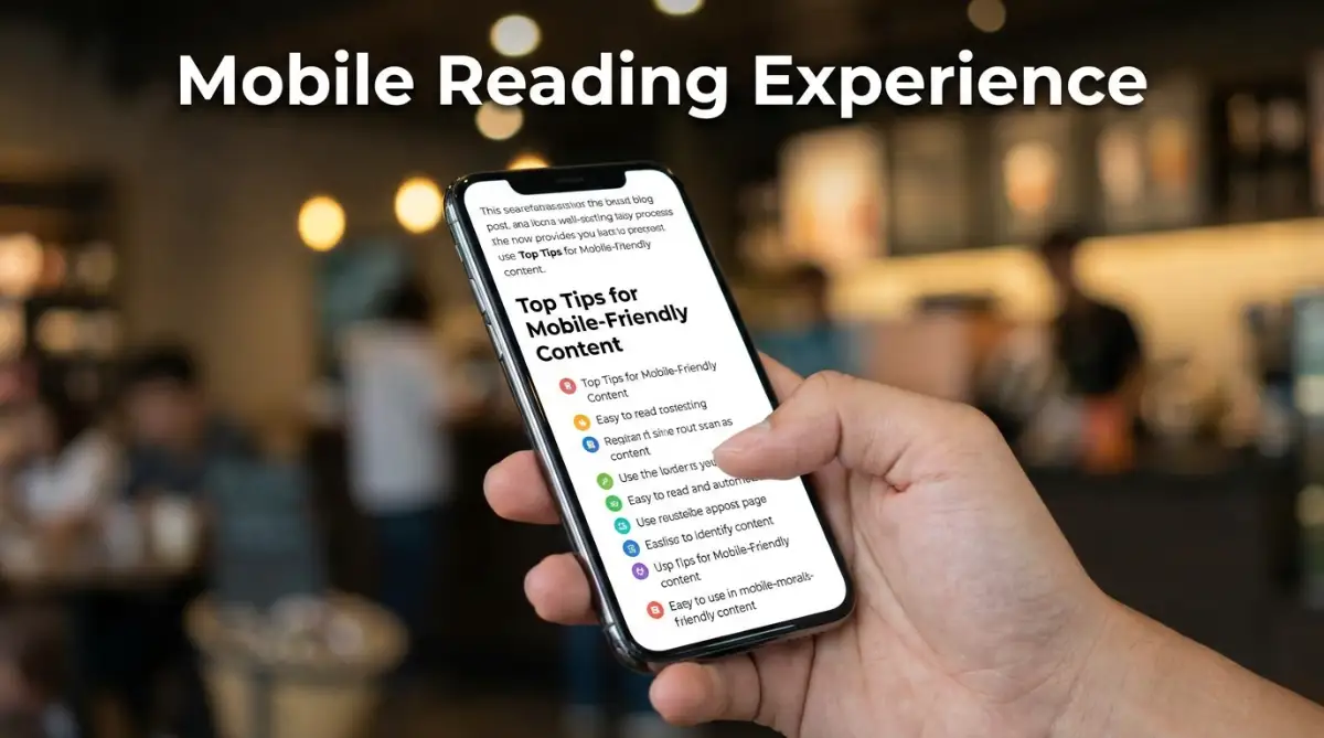
We live in an era where the majority of online reading happens on small glass rectangles in the palms of our hands. You might be writing your article on a massive twenty-four-inch desktop monitor, but your reader is likely viewing it on a six-inch smartphone screen. This changes everything.
A perfectly fine, three-sentence paragraph on your desktop monitor might look okay to you. But when that exact same paragraph is squished onto a narrow mobile screen, it suddenly transforms into an intimidating ten-line block of text.
You must format your content with the mobile user in mind first. This means being aggressively brief with your formatting choices.
Before you hit publish, you absolutely must preview how the post looks on a mobile view. Check if your images are breaking the margins, or if your headings are taking up too much vertical space. If a single paragraph fills up the entire screen of a smartphone without any white space, it is too long.
If you want to see exactly how to structure your next draft for maximum readability across all devices, watch this incredibly helpful breakdown right now.
The Psychology of Colors and Contrast
Another silent killer of reader engagement is poor color contrast. We often want our websites to look unique, so we experiment with different background colors and text shades. This usually ends in a massive disaster for readability.
The highest level of readability always comes from dark text on a light background. There is a reason almost every successful book and newspaper in history is printed with black ink on white paper. Our eyes are naturally trained to process this specific contrast with the least amount of effort.
Using light gray text on a white background is a very common design trend that looks sleek but completely ruins the reading experience. It forces the eyes to strain heavily to distinguish the letters from the background.
Similarly, dark mode is highly popular, but using pure white text on a pure black background creates an intense visual halation effect for many people with astigmatism. The words literally seem to blur and bleed into the darkness.
If you want a dark theme, use a very dark gray background with off-white or light gray text. It softens the contrast just enough to remove the harsh glare. Always prioritize reading comfort over attempting to look overly stylish.
Mastering the Art of Skimmable Subheadings
Let us talk about how people actually navigate an article. As mentioned earlier, people do not read online; they skim. They scroll rapidly down the page looking for the specific piece of information they actually care about.
Subheadings are the signposts that guide your reader through your content. If your article is a two-thousand-word journey, your subheadings tell the reader exactly where they are and what they will find next.
A terrible mistake is using boring, generic subheadings like "Step 1" or "The Solution." These tell the reader absolutely nothing about the value of the section. Your subheadings need to be highly descriptive and slightly intriguing.
For example, instead of writing "How to Sleep," you should write something like "The Pre-Bedtime Routine for Deep Rest." This immediately tells the skimmer exactly what they will gain by stopping to read that specific section.
Furthermore, you need to use the correct HTML tags for your headings. Your main title should always be an H1 tag. The main sections of your article must be H2 tags.
If you have sub-points under an H2, use H3 tags. This creates a logical, visual hierarchy. The H2 tags should be larger and bolder than the H3 tags. This clearly shows the reader the relationship between your ideas without them having to think about it.
The Power of Strategic Bolding and Italics
When someone is skimming your article, you want to forcibly grab their attention and pull them into the text. The easiest way to do this is through strategic formatting of individual words and phrases. Bolding is your absolute best friend when used correctly.
When you bold a key phrase or an important takeaway, you create a visual anchor point on the screen. As the reader scrolls quickly, their eyes will naturally stop on the heavy, dark text.
If that bolded text contains a highly valuable piece of information, they will often stop scrolling and read the surrounding paragraph. It acts like a speed bump for fast scrollers.
However, you must avoid overusing this tool. If you bold every other sentence in your article, the effect is completely ruined. It just makes the page look messy and aggressive.
Reserve your bold text for the most critical insights, data points, or main takeaways. You want the bolded words to summarize the core message of that specific section.
Italics should be used differently. They are excellent for adding conversational emphasis to a specific word, just like you would emphasize it when speaking out loud. They are also great for internal thoughts or short quotes. But never use italics for a large block of text, as the slanted letters are notoriously hard to read in bulk.
Why Bullet Points Are Visual Candy
If you want to present a list of items, features, or steps, never write them out in a standard paragraph with commas. It is extremely boring and very hard for the brain to process quickly. This is where bullet points become incredibly valuable.
Bullet points act like visual candy for the reader. They instantly break up the monotony of standard paragraphs. They signal to the brain that the upcoming information is highly organized and easy to digest.
When a reader sees a bulleted list, they almost always stop to read it. It feels like a shortcut. They know they can absorb three or four key facts in just a few seconds without having to dig through heavy sentences.
There are a few rules for making your lists effective. First, keep the points relatively short. If your bullet point is five sentences long, it is not a bullet point anymore; it is just a paragraph with a dot next to it.
Second, try to keep the phrasing parallel. If your first bullet point starts with a verb, the rest of them should probably start with verbs too. This creates a rhythmic, predictable flow that is highly satisfying to read.
The Danger of Center-Aligned Text
Alignment is a subtle formatting choice that has massive implications for readability. Many bloggers try to make their content look poetic or artistic by center-aligning all their paragraphs. This is a tremendous mistake.
In western languages, we read from left to right. Our eyes naturally return to the same invisible vertical line on the left side of the screen every time we finish a sentence. This is called a hard edge.
When you center-align your text, you destroy that hard edge. The starting position for every single line is totally different. This forces the reader's eyes to constantly hunt for the beginning of the next line.
This tiny amount of visual hunting adds up to significant eye fatigue very quickly. Center alignment should only be used for very specific, short elements. It is fine for main titles, short quotes, or image captions.
But for your main body paragraphs, always use left alignment. It provides that comfortable, predictable starting point for the eyes, keeping the cognitive load as low as possible.
Justifying your text, where both the left and right edges are perfectly straight, is also a bad idea for the web. It creates weird, uneven spaces between the words that look like rivers of white space running down the page. Left alignment is always the safest, most readable choice.
By paying close attention to these visual elements, you stop fighting against the reader's natural habits. You start guiding them smoothly through your thoughts.
We have covered the core structural mistakes that send people running. Now, we are going to dive much deeper into the advanced formatting tactics that turn casual skimmers into loyal, dedicated readers.
Psychological Formatting Secrets of Top-Tier Writers
Now that we have covered the basics of paragraphs and typography, it is time to look at the advanced tactics. These are the exact strategies professional copywriters use to keep you reading all the way to the bottom of the page.
You do not need to be an expert web designer to use these methods. They are purely structural changes that instantly make your writing feel more engaging, authoritative, and addictive. I use these every single time I write, and they completely transformed my reader retention metrics.
Mastering the Art of Bucket Brigades
Have you ever been reading a long article and suddenly noticed a very short, punchy sentence on its own line? It usually looks something like "Here is the truth:" or "But wait, there is more." These are called bucket brigades.
Originally used by old-school sales letter writers, bucket brigades are designed to physically pull the reader down the page. They act as a bridge between a boring thought and a highly interesting thought.
When a reader starts to lose focus, a short, bolded bucket brigade breaks their scrolling habit. It creates a tiny cliffhanger in the mind. The brain naturally wants to resolve the suspense, so the eyes automatically jump to the next paragraph to find the answer.
You can easily insert these into your own writing today. Try using phrases like "Think about it," "Let me explain," or "Here is the crazy part" right before a major takeaway. It is a simple psychological trick that works flawlessly to reset the reader's attention span.
Designing for the F-Pattern
When someone opens your newly published article, they do not read it word for word. Instead, human eyes naturally scan digital screens in a very specific shape. Knowing this shape gives you an incredible advantage.
According to extensive eye-tracking studies on how people read on the web by the Nielsen Norman Group, the vast majority of users scan in an F-shaped pattern. They read the headline across the top, scan down the left side of the page, read a little bit across the first sub-heading, and then continue scanning straight down the left margin.
If you bury your best information on the right side of a massive paragraph, nobody will ever see it. You must front-load your most important words.
Start your paragraphs with strong, descriptive words. Make sure your subheadings clearly state the value of the section on the left side of the screen. If your reader is only going to scan the left edge of your article, you have to ensure they still get the main idea of your entire post.
The Magic of the Sticky Table of Contents
Imagine walking into a massive grocery store without any signs hanging above the aisles. You would feel completely lost and probably leave if you were in a hurry. A long-form blog post without a table of contents causes that exact same frustration.
When you write an in-depth, two-thousand-word guide, you are asking for a huge time commitment from a stranger. Giving them a clickable table of contents at the top of the page instantly lowers their anxiety. It acts as a clear, organized map of your thoughts.
If they only care about one specific step, they can click the link and jump straight to it. Some writers worry this will hurt their overall reading time. In reality, giving readers control over their experience builds massive trust.
This trust is exactly what builds a loyal audience. It is very similar to avoiding common cryptocurrency investing myths new traders fall for; when you provide clear, honest directions instead of confusing hype, people respect your authority. A table of contents shows you respect their time.
Using Blockquotes for Visual Breaks
Sometimes, you need to highlight a specific fact, a quote from an expert, or a core principle. Instead of just bolding the text, you should use the blockquote formatting feature in your publishing software.
A blockquote visually indents the text and usually adds a stylish vertical line to the left side. It completely changes the background color or font style for just that one sentence. This creates a massive visual break that wakes up a tired reader.
I love using blockquotes to summarize a long section. If someone is speed-reading, they will almost always stop to read the blockquote. It makes your article look professionally designed and deeply researched, even if you just wrote it in your living room.
Understanding Visual Hierarchy
Everything on your page has a specific visual weight. A giant image is very heavy. A tiny gray copyright notice at the bottom is very light. Visual hierarchy is the process of arranging these elements so the reader knows exactly what is most important.
If your subheadings are the exact same size as your regular text, you have zero visual hierarchy. The reader has no idea where one thought ends and a new one begins.
The Interaction Design Foundation explains that visual hierarchy is the easiest way to guide a user's eye exactly where you want it to go. You control the journey.
Make your H2 headings large and bold. Add extra white space above the heading so it clearly separates from the previous section. Make your H3 headings slightly smaller, but still distinct. This organized structure feels incredibly satisfying and easy to process for the human brain.
The Formatting Nightmares You Must Stop Making Today
Now we need to talk about the toxic habits that are secretly ruining your hard work. You might be making these mistakes right now without even realizing the damage they cause. Let us look at the most dangerous pitfalls that make readers hit the back button.
The "Ransom Note" Typography Disaster
We all want our blogs to look unique and heavily branded. In an effort to stand out, many beginners decide to use three or four completely different fonts on a single page. They use a curly font for the title, a blocky font for the headings, and a completely different style for the body text.
This creates a chaotic, messy look that designers jokingly call a "ransom note." It is incredibly distracting and makes your website look very amateurish. When your design looks cheap, readers assume your information is also cheap.
You should never use more than two font families on your entire website. Choose one clean, bold font for your headings, and a highly readable, simple font for your body text. Consistency is the ultimate secret to looking like a trusted professional.
Ignoring Mobile Margins and Padding
I see this mistake constantly on brand new blogs. The writer formats their text perfectly on a laptop, but they completely forget to check the mobile view. When you open the post on a phone, the text stretches entirely from the far left edge of the glass to the far right edge.
There is absolutely no breathing room on the sides. The words are practically falling off the screen. This lack of padding creates severe claustrophobia for the reader's eyes.
Proper mobile design requires at least a small amount of white space on the left and right sides of the screen. The W3C accessibility guidelines for reading specifically note that text needs clear margins to be easily processed. Always check your mobile layout to ensure your words have a safe, clean border to rest inside.
Burying the Lead Under Giant Images
High-quality images are fantastic for breaking up text, but their placement is incredibly sensitive. A major mistake is placing a massive, vertical image right after your main title, before you even write your first sentence.
When a mobile user lands on your page, all they see is a giant picture. They have to scroll aggressively just to find your opening paragraph. If they have to work hard just to find the start of your article, they will leave.
This is deeply frustrating for someone seeking a quick answer. It is a terrible first impression. Just like the tiny, confusing fine print found in predatory payday loan contracts, hiding your main message behind massive visual barriers instantly destroys trust.
Always put at least two or three short, highly engaging paragraphs before you introduce your first big image. Hook the reader with your words first, and use the images as a reward for scrolling further down the page.
Writing "Academic" Style Content
Many people still write like they are trying to impress their high school English teacher. They use incredibly complex vocabulary, long-winded sentences, and massive, unbroken paragraphs. They think this makes them sound smart and authoritative.
On the internet, this strategy completely backfires. People are exhausted, distracted, and busy. They do not want to read an academic journal while waiting for the bus or drinking their morning coffee.
If your writing is too dense, you are actively pushing people away. These small formatting and styling errors add up quickly. It is very similar to the reality of the housing market; hidden money mistakes that sabotage real estate closings are rarely one huge error, but rather a dozen small oversights that ruin the final outcome.
Keep your language at a middle-school reading level. Write exactly like you talk to a good friend over dinner. If you would not use a word in casual conversation, do not use it in your blog post.
The Low Contrast Trap
I briefly touched on this earlier, but it is a trap so many writers fall into. You find a beautiful, minimalist WordPress theme that uses a soft, light gray font on a crisp white background. It looks very modern and artistic.
However, anyone over the age of forty, or anyone reading your blog outside in the sunlight, will not be able to read a single word. Poor color contrast makes your content completely inaccessible to millions of people.
If you are unsure if your colors are readable, run them through the WebAIM contrast checker tool online. If your text fails the basic accessibility score, you are literally throwing away potential traffic. Always choose dark, highly contrasted text to guarantee everyone can comfortably enjoy your work.
If you notice a sudden drop in your readership, terrible contrast is often one of those subtle warning signs you can't ignore. Fix your font colors today, and you will likely see your page engagement metrics bounce right back up.
Your Master Plan for Reader Retention
We have covered an immense amount of ground today. You now know exactly why people abandon boring, cluttered websites and how to turn your own articles into visually stunning experiences.
You do not need to memorize every single rule right now. The best way to implement these changes is to create a simple pre-publish checklist.
Do's and Don'ts for Your Next Draft:
- Do: Break your paragraphs down to a maximum of three sentences.
- Do: Bold the most interesting phrase in every section to catch skimmers.
- Don't: Center-align your main body text under any circumstances.
- Don't: Forget to check the mobile view before you hit the publish button.
Formatting is not about making things look pretty. It is about removing friction. When you remove the friction, the true quality of your writing finally gets the spotlight it deserves.
Think of formatting as a promise to your reader. When your page looks clean, organized, and breathable, you are silently promising them that reading your work will be an easy, enjoyable experience. Just like providing a clear, honest explanation on understanding debt consolidation, a well-formatted post proves you actually care about helping the user.
I know how overwhelming it can feel to stare at a blank screen and worry about margins, fonts, and bolding. But I promise you, once you start writing with these simple visual rules in mind, it becomes completely second nature. Your readers will stay longer, your bounce rate will drop, and you will finally start seeing the amazing results your hard work truly deserves!
Common Questions About Blog Readability
How long should a blog post paragraph ideally be?
For online reading, your paragraphs should almost never exceed three sentences. Many times, a highly impactful single-sentence paragraph is the best choice. This creates a massive amount of white space, making the article look incredibly easy to read on mobile devices.
What is the absolute best font size for mobile reading?
For modern smartphones, your main body text should be at least 16 pixels, but 18 pixels is quickly becoming the new standard. Anything smaller than 16 pixels forces the user to squint or manually zoom in, which ruins the reading experience and increases bounce rates.
Do I really need to use bullet points in every single post?
While you do not have to use them in every post, bullet points are one of the most powerful tools to break up visual monotony. They naturally draw the eye and organize complex information. If you have a list of three or more items in a paragraph, you should always convert it into a bulleted list.
Why is white space considered so important in online writing?
White space, or negative space, gives the reader's eyes a physical place to rest while scrolling. It reduces cognitive load and prevents the brain from feeling overwhelmed by a wall of text. More white space directly translates to a calmer, more enjoyable reading environment.
Can bad formatting actually hurt my SEO rankings?
Yes, absolutely. Bad formatting frustrates readers, causing them to leave your site immediately. Google tracks this behavior, known as a high bounce rate and low dwell time. If Google sees people constantly abandoning your page quickly, they will push your article further down in the search results.
Disclaimer: The formatting guidelines and strategies provided in this article are based on general best practices for web writing, readability, and user experience. Individual results regarding reader retention and SEO performance may vary depending on your specific niche, audience demographics, and the overall quality of your written content. Always test different layouts and typography choices on your own platform to see what resonates best with your unique audience.